I would like to analyse some digipaks to influence the development of our own digipak. Since developing some front cover ideas for the digipak I knew I needed to look at some existing examples to distinguish the conventions a digipak, so that what we produce is produce is a successful digipak that will appeal to people who listen to indie music. So the examples I decided to look at are all examples of indie digipaks by indie artists.
Kings of Leon- Only By The Night Album cover
 |
|
I chose this cover by Kings of Leon for their album 'Only By The Night' made in 2008, I though the juxtaposition of the band members faces split into four section embroiled onto a an eagle. between the two faces captures only they eyes and their hair while the other two band members are less recognisable with only their bottom half of their face below the eyes, which is framed around these harrowing eyes of the bird. I thought this is a very interesting album cover I think this probably represents the unexpected dimensions to the album or the oddity of man and bird-hybrid could mean they see humanity as one, whatever the motive of the artwork I would definitely like to emulate something in this fashion of images divided up like this probably using image of nature which they embody by the view of the bird. The colour of the cover is between a darkish green with faded black corners with the name of the album on the left and the name of the album on the right in the same colour yellow which stands out above the background colour, However the typography is small which is probably so our focus is on the ambiguity of the artwork is obviously the main important feature of the album.
Coldplay Mylo Xyloto Digipak


Brit Rockers ColdPlay new entitled Mylo Xyloto features graffiti pop-up art designed by David A. Carter. On the left is the front cover of the digipak with the album name but without the bands name the typography is like a bubble like font which is only an outline with no filling in the font which allows you to see the rest of the graffiti artwork. The artwork used for the cover is fun and vibrant with the main colours being blue, purple, pink and yellow. Some of the artwork compiles some long text along with images of clouds and other abstract patterns.

Then below the front panel is the back with the track list for the album in the same style of the typography used for the front cover. Then below the songs are some symbols also in white outlines including a heart, birds and other symbols that may be related to the mood or themes of the album.
The CD panel is the same rainbow colour used for the back panel containing a black swirl which listed the songs of the album above it in white in the interesting pattern around the CD.
This album by coldplay is unique because the artwork was specifically for this album and the same colour scheme and artwork is used through all three panels. This digipak differs from the cover for the Kings of Leon album such as there being no sign of member of the band featured on the digipak, this could that they are internationally recognised that fans know who they are and know what they look like that it would be more interesting to do something creative which both coldplay's and kings if Leon album share.
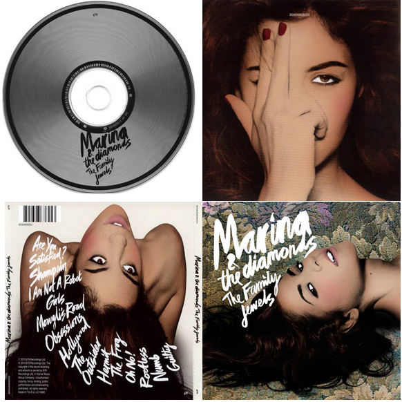
Marina and The Diamonds Digipak

This digipak is for the solo artist Marina who is indie-pop. Her digipak differs from the two above because it features her on three out of four panels of the artist with the same editing style which is difficult to describe but it reminds me of old Hollywood glam and all the shots of her feature her eyes. The images of her are quite sultry and overly confident and fierce there she dominates the album and that is probably suitable since it her album and none of these shots show her with clothing she is either thrusting her head in some awkward direction that builds a shape and interesting dynamic for the album which I like. The front panel has the her stage name and the name of the album The Family Jewels, in the same typograpghy but in a smaller font. this dominates the the cover against the rich gold, green and purple floral background. The back panel is different background that is a simple white background with her hair flowing down the edge of the panel displaying the tracklist in a downward swipe to the right, which is distinctively different to the basic tracklisting postioned one beneath the other like the coldplay back panel. Also another significant feature of the back panel is the bar code used when purchasing items from a store. Then the cd panel is again is plain and simple with a silver appearance with black circles near the outside of the cd and near the hole in the centre, with the artist and album name displayed in black on top of the cd.
Conclusion:-
I found this research useful and I am already inspired by some of the examples I have analysed for the development for our artist digipak. I learned how it doesn't matter that the artist is evident on the cover of the album and how indie digipak are mostly artistically inspired to be different whether if is the style of photography used in the Marinna and The Diamonds album over, or the incorporation of nature in the Kings of Leon album or physical art piece personalised for the scheme of the coldplay album. I can go in any direction for the indie album from looking at these as a guide. I know that for the digipak we will display a bar code so that it fulfils the convention of a regular digipak in a music store.


No comments:
Post a Comment