I would like to analyse some digipaks to influence the development of our own digipak. Since developing some front cover ideas for the digipak I knew I needed to look at some existing examples to distinguish the conventions a digipak, so that what we produce is produce is a successful digipak that will appeal to people who listen to indie music. So the examples I decided to look at are all examples of indie digipaks by indie artists.
Kings of Leon- Only By The Night Album cover
I chose this cover by Kings of Leon for their album 'Only By The Night' made in 2008, I though the juxtaposition of the band members faces split into four section embroiled onto a an eagle. between the two faces captures only they eyes and their hair while the other two band members are less recognisable with only their bottom half of their face below the eyes, which is framed around these harrowing eyes of the bird. I thought this is a very interesting album cover I think this probably represents the unexpected dimensions to the album or the oddity of man and bird-hybrid could mean they see humanity as one, whatever the motive of the artwork I would definitely like to emulate something in this fashion of images divided up like this probably using image of nature which they embody by the view of the bird. The colour of the cover is between a darkish green with faded black corners with the name of the album on the left and the name of the album on the right in the same colour yellow which stands out above the background colour, However the typography is small which is probably so our focus is on the ambiguity of the artwork is obviously the main important feature of the album. Coldplay Mylo Xyloto Digipak
Brit Rockers ColdPlay new entitled Mylo Xyloto features graffiti pop-up art designed by David A. Carter. On the left is the front cover of the digipak with the album name but without the bands name the typography is like a bubble like font which is only an outline with no filling in the font which allows you to see the rest of the graffiti artwork. The artwork used for the cover is fun and vibrant with the main colours being blue, purple, pink and yellow. Some of the artwork compiles some long text along with images of clouds and other abstract patterns. Then below the front panel is the back with the track list for the album in the same style of the typography used for the front cover. Then below the songs are some symbols also in white outlines including a heart, birds and other symbols that may be related to the mood or themes of the album.
The CD panel is the same rainbow colour used for the back panel containing a black swirl which listed the songs of the album above it in white in the interesting pattern around the CD.
This album by coldplay is unique because the artwork was specifically for this album and the same colour scheme and artwork is used through all three panels. This digipak differs from the cover for the Kings of Leon album such as there being no sign of member of the band featured on the digipak, this could that they are internationally recognised that fans know who they are and know what they look like that it would be more interesting to do something creative which both coldplay's and kings if Leon album share.
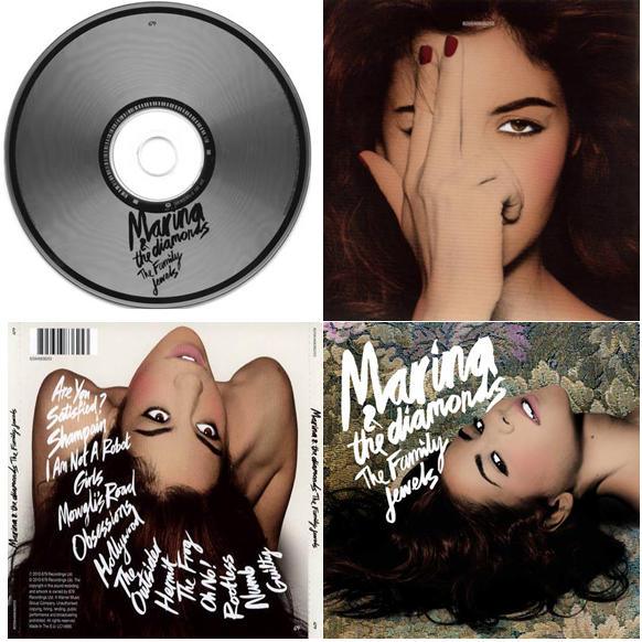
Marina and The Diamonds Digipak
This digipak is for the solo artist Marina who is indie-pop. Her digipak differs from the two above because it features her on three out of four panels of the artist with the same editing style which is difficult to describe but it reminds me of old Hollywood glam and all the shots of her feature her eyes. The images of her are quite sultry and overly confident and fierce there she dominates the album and that is probably suitable since it her album and none of these shots show her with clothing she is either thrusting her head in some awkward direction that builds a shape and interesting dynamic for the album which I like. The front panel has the her stage name and the name of the album The Family Jewels, in the same typograpghy but in a smaller font. this dominates the the cover against the rich gold, green and purple floral background. The back panel is different background that is a simple white background with her hair flowing down the edge of the panel displaying the tracklist in a downward swipe to the right, which is distinctively different to the basic tracklisting postioned one beneath the other like the coldplay back panel. Also another significant feature of the back panel is the bar code used when purchasing items from a store. Then the cd panel is again is plain and simple with a silver appearance with black circles near the outside of the cd and near the hole in the centre, with the artist and album name displayed in black on top of the cd.
Conclusion:-
I found this research useful and I am already inspired by some of the examples I have analysed for the development for our artist digipak. I learned how it doesn't matter that the artist is evident on the cover of the album and how indie digipak are mostly artistically inspired to be different whether if is the style of photography used in the Marinna and The Diamonds album over, or the incorporation of nature in the Kings of Leon album or physical art piece personalised for the scheme of the coldplay album. I can go in any direction for the indie album from looking at these as a guide. I know that for the digipak we will display a bar code so that it fulfils the convention of a regular digipak in a music store.
I surveyed 10 people who like to listen to indie music to answer the questionnaire as my audience research. I gained a lot of quality feedback on the question related to the name of the song, the artist name, the album and whether they liked the tone of the song.
I gathered some of the quotes that I got from replies over emails on the questionnaire I had sent out.
These are some of the comment on the name of the solo indie artist, ‘Oliver Fox’:-
‘I like that his last name is Fox, it adds appeal.’
‘I would definitely associate a cool name like that to indie artist’
‘I think is name that would resonate with everyone’
‘His name sounds like it would be popular, and I think he’d be a cool dude!’
‘Oliver Fox sounds genuine I wish I could rock a name like that’
Everyone that i interviwed said yas to listening to indie nusic regulry, so this is good to know that thier judgement can be based on the current fashion of indie music, artist and their musical material such as albums.
Here are their thoughts on the album name…
‘The album name is unlike any other name I never heard used before which is unique and dramatic’
‘I don’t get much from the name unrest, I don’t think I like it very much’
‘I thought unrest sounds a little bit on the dreary side’
‘I kinda like the album name, unrest is ambiguous and alluring I would by the album under this name because I would want to know more behind the name’
‘I think its ok, my only thing is that the general buyers of indie music might find it odd and result in not buying such an album’
‘I don’t like indie music, but I guess the name sounds good.’
These are their thoughts on the tone of the song.
‘I like it is fun but very calm and really true indie music’
‘It’s a great song about heartbreak I think it works well under the name you had in mind’
‘I’m a fan of indie music, and I listen to it regularly, Noah + the Whales songs are easy listening. Sometimes people find it hard to understand their plots, but if you produce a good video, then it will be evident.’
‘I think this is more of a positive upbeat song based on the tone of the song I don’t think it works being sad and depressed’ .
I value all of the comments made in the key areas surrounding the names of the artist, album and overall tone, a lot of the what was said were valid comments such as the tone of the song may not be a depressing song or comments about the artist name having a lot of edge and authenticity of a real indie artist. From this audience research I can finally move forward with confidence that the majority had a positive response to the decisions we made.
In our media lesson our group spent a huge part of it discussing the name for the artist. We decided that he would be a solo artist name Oliver Fox. The journey leading to this name was really interesting here are few of them.
We all agreed that Oliver should be the first name form there we each came up with some last names in the second column. The three highlighted were our favourites, but we narrowed it down to the be -st highlight in green in the last column.
After that process we were really pleased with the success of the name has a unique essence of a real indie artist, plus to being short, catchy and easy for audience to remember. When we were debating names we were often inspired in some of the option by nature indie artists relate to nature in their music videos, such as, Marc Foster ‘I Was Broken’ compiles shots of nature. Our artist name also relates to nature with the Fox, and indie artists sometimes relate to nature in their songs
The song we are using for music video is Blue Skies, but we will rename the title track ‘Nights of Broken Sleep’. We all thought that it has the same idea of the original story of the Blue Skies about a boy trying to overcome feelings of pain over the end of his relationship to his girlfriend. ‘Nights of Broken Sleep’ is about him suffering from a broken heart, and losing himself and a grasp on reality, because without her he is alone.
Ideas of Album names:
-Calm after the Storm
-Unrest
-Untold
-Just
-Transcend
-Rise
-Touchstone
-Phoenix
These were the options of album names and we decided to go with ‘Unrest’, because we thought it needed to be memorable and the title song is a representation of the tone of the rest of the album. I think ‘Unrest’ leaves an element of mystery, which is up for perception of its audience on what it is means in relation to the artist. I personally like the name and works as an indie album name.
LYRICS. I walk a lonely road
The only one that I have ever known
Don't know where it goes
But it's home to me and I walk alone
I walk this empty street
On the Boulevard of Broken Dreams
When the city sleeps
And I'm the only one and I walk alone
I walk alone
I walk alone
I walk alone
I walk a...
My shadow's the only one that walks beside me
My shallow heart's the only thing that's beating
Sometimes I wish someone out there will find me
'til then I walk alone
Ah-ah, ah-ah, ah-ah, aaah-ah,
Ah-ah, ah-ah, ah-ah
I'm walking down the line
That divides me somewhere in my mind
On the border line
Of the edge and where I walk alone
Read between the lines
What's fucked up when everything's alright
Check my vital signs
To know I'm still alive and I walk alone
I walk alone
I walk alone
I walk alone
I walk a...
My shadow's the only one that walks beside me
My shallow heart's the only thing that's beating
Sometimes I wish someone out there will find me
'til then I walk alone
Ah-ah, ah-ah, ah-ah, aaah-ah
Ah-ah, ah-ah
I walk alone
I walk a...
I walk this empty street
On the Boulevard of Broken Dreams
When the city sleeps
And I'm the only one and I walk a...
My shadow's the only one that walks beside me
My shallow heart's the only thing that's beating
Sometimes I wish someone out there will find me
'til then I walk alone...
This video begins with the band strolling in a stalling car with the bands name 'Green Day' on the hood of the car, in the middle of the desert setting. Yet the audience is assured it is part of the video as a non-diegetic sound of the radio of the track, then there is a whistling of the broken car. This is followed by a quick transition between the different views of the car. In the start the camera looks from beneath the car where we see smoke puffing out, to a longs hot of the band seated in the car, and close ups of the busted headlights. We then see them abandoning the car and starting to walk in a melancholy fashion, all sharing black item of clothing, such as a blazer, trouser on a shirt bow tie or tie, and boots. This already set a depressive appearance of the band, which we could associate with funerals having to dress in black for a lost of a love one.
We then see them abandoning the car and starting to walk in a melancholy fashion, all sharing black item of clothing blazer, trouser on a shirt bow tie, tie and boots This already set a depressive appearance of the band, which we could associate with funerals having to dress in black for a lost of a love one. They're dressing is a true there indie rock band style.
As the the first lyric in the song 'I walk a lonely road' sang by the lead singer while sill walking the empty crossroads. This shot is a medium long shot of his arm crossed and performing the song towards the camera as if he is introducing a narrative to the audience. In that frame of him singing uses a distortive layering of white scratches and black spots over the shot. The director Samuel Bayer used unorthodox techniques to achieve the aged look of the "Boulevard of Broken Dreams" video, including using rear projection (as opposed to green screen) and physical damaging the negative: scratching the film with razor blades, pouring coffee on it, and smudging cigarettes on it.
'Don't know where it goes' were them walk through the desert and exhibit some mise-en scene of the desolate house then the band walking past extras such as a woman in the front of the camera but her head cut of to see a long shot of the band in the distance still walking quite glum, with the lead singer still mouthing the words. is this the boulevard of loss identity? The woman arms are crossed similarly to the nature of the singers body language at the start as the sing 'I walk alone, I walk alone', while stood next to a letter box seems like ordinary things like the house and the woman but the emotional balance of the surrounding is dark and gloomy.
We often get close up of the other two members faces to capture they're emotions as they move forward and even shots of them pulling they're blazer to muscle the harsh winds.
They walk past other objects like a gas tank, trash can and an odd goose fluttering into the comer. While the camera remains at a long shot of the band walking still sad and opressed.
The editing they use to change shots is by dissolving from one shot into another.
The camera shows them walking at a long shot of them from the side to short cuts back an forth of the the lead singer singing the words of the song. The camera is positioned in front of him at a medium long shot as if he is the storyteller of the video. There isn't any lighting when the singer draws closer into the frame, it is very dramatic how the darkness masks his face.
Another effect made in the editing to create distortion when the camera looks like it looses focus and then blurs the band member faces, then diminishing they're emotions.
The also used a white lighting as apart of the mise-en scene which adds a theatrical experience within the video.
The music video also includes a performance element with the band playing in an empty room with discoloured walls, lighting arranged in the background, as confetti and glitter fall down. I like that the use of glitter and confetti are like a conceptual depiction of rain, a fancy way to develop a fun scene among all the gloom.
More shots of grief stricken surroundings on the projection of a streets and roads with extras stood before it in a morbid state matching the lyrics of the song.
I realised a lot of props were used in the video such as the signage above.
The lighting starts to dim as it nears to the end of the song, these scenes have darkened adding a time element to the music video travelling through the daylight into night still surrounded by lonely people and the lead singer still adopting such energy in his demeaner.
The emotion of the band mounts where locations revert back to then performing in the empty warehouse/room with their instruments performing the song with a lot of energetic jumping and rocking on the drums while the other to rock out on their guitars. Again the camera makes quick changes to each of the member of the band alone or either a long shot including all of them up until the end of the video.
6) Images of the costumes and props we intend to use in the video.
Here are photos hannah took that she will be wering during filiming as she is our female lead for our music video.
This is the Beatles top, jean
jacket and coat that hannah will wear as her costume during filiming the music video.
Jonathan a perfroming arts student a friend to all of us in the group and our lead actor and artist for music video. Below are some great picture Hannah took of our actor Jonathan also in his costume for music video that both character meet the simple lothing that ties in with the conventions of an indie attire.
This is Jonathon, well known for
his classic gentleman style
Hannah and Radhika suggested that we use Blue Skies by the English folk band Noah and the the Whale for the song for our music video. I had never heard of the song until today and me and mark were certainly sold, and were confident this would be a perfect fit for the genre of our music video. We are currently planning the video now and we have decide to make the video a narrative piece because the song already tells a story of it own we would like to develop our own narrative for the song.
The video for the song features parts of the movie that goes with the homonymous album The First Days of Spring. It is introduced by the conversation between two friends, when one of them suggests that they should "go on" and live, which they had only done "a long time ago". It also serves as the film's trailer. Watch they're offical video below and leave comments on what you think about the song?
The word is a combination of producer and consumer that perfectly describe the millions of participants in the Web 2.0 revolution; the consumer use the online technical devises to construct their own media products. The term came from Marshall McLuhan and Barrington Nevitt’s Take Today book published 1972 on page four, that with electrical technology, the consumer would become a producer. Alvin Tofflers book published in during 1980 called ‘The third Wave’, would coin it “prosumer”. His prediction is true today that the roles of producers and consumers would begin to blur and merge. However, in the book he refers to the group of people as “producing consumer”, this is when the prosumer creates goods for their own use and possibly to sell. For example, blogging is an online format based on our own personal subject matter, that can reach to thousands other user/prosumers online. I think prosumer means the transition from a passive consumers being passive are functioning as active participants in the process of online media products design and customization of the end product.
What people like Marshall McLuuhan and Berrington Nevitt predicted about the next generation of the internet were incredibly true , because web 2.0 in comparison web 1.0 is that it is digital-text flexible and easy for users to organised information/products online.
Wikipedia states- The term has also taken on multiple meanings in business and economics: the business sector sees the prosumer (professional–consumer) as a market segment, whereas economists see the prosumer (producer–consumer) as having greater independence from the mainstream economy. These differing meanings often describe the same people; consumers unusually interested in the products. It can also be used to differentiate the traditional passive consumer with an active consumer role more involved in the process, such as activity in the design or customization of the end product.
Morning Session - Welcome by Thalia Cassimatis, Rich Mix Education Officer.
-Presentation with clips by Pete Fraser – The history of the music video, codes and conventions and top tips for making your own pop promo.
Afternoon Session-Presentation with clips by Liz Kessler – working in the industry and commissioning and producing music videos.
-Q&A session with Corin Hardy – working as a music video director.
On Tuesday 29th November I attended an educational event dedicated to the history, origination and the continual evolvement of music videos. Music videos are powerful and enticing media form. I became excited for what we were to learn, such as, the key concepts in media studies.
The day was split into two parts with a morning and afternoon session. We began the day by observing a presentation with clips by Pete Fraser who is the chief examiner for OCR A Level Media Studies and is also the author of the BFI Film and Media Studies resource Teaching Music Video.
These showed us the history of music videos and showed us some top tips for making our own indie promo. He taught us that music videos last the length of the song, sometimes longer. They sometimes feature the artist and they sometimes tell a story. Here is some history I learnt about music videos:
1930′s: Experimental
-This was the decade of experimentation.
-Colours and shapes were found in time with music videos.
-End of this era, Disney did similar ideas with Fantasia.
The 1930s saw the emergence of ‘A Colour Box’ by fine artist Len Lye. He creates visual to illustrate the background track (lyrics) in shape and movement. I thought this was ingenious and very distinct relationship of the ink following the rhythm of the music.
1940’s: Soundies -1940′s in America found juke box TV’s for music videos
-After the war came small films with soundtracks
-The soundies dies down because of censorship.
-The soundies died out as there was an objection to the sexual references involved.
"The Frim Fram Sauce" is best remembered for its silly lyrics. The narrator speaks to a waiter in a restaurant, as if in the process of ordering food. Throughout the song, the customer lists numerous real foods that he doesn't want, such as pork chops and fish cakes. In the chorus, he explains what he really wants: some "frim fram sauce" with the "ossenfay" and "chifafa" on the side. Of course, none of these foods really exist, so at the end he gives up and says: "If you don't have it, just bring me a check for the water!"
1960’s: Scopitones
-Came in 1960′s in France. Later came to America and the UK.
-Similar to the soundies dukebox that it would show the music video on screen.
-European artists mostly appeared on these.
-Released films like the previous music videos seen with hand held and other techniques.
Scopitones were often ‘sexy’, but it would compile a lot of fun colours, feature artist, dancing, and concepts including Scopiton gals and Guys.
This paved the way for music videos- Bands started to produce proper music videos. (E.g. The Beatles).
The Beatles Can’t buy me love video was used to showcase the song. It was the first of its kind, the idea of promoting your music with a visual attachment was not considered then to be the norm, but it transformed the solution in which the music industry could adopt effective promotion of artist singles.
1970’s
-Became more common for artists to release music promos-very important.
- Queen – “Bohemian Rhapsody” was No#1 on Top of the Pops for 7 weeks due to video.
1980’s
-MTV 1981 – Round the Clock Music Video programme –born in America, which was largely dominated by British bands.
-Important artists at this time- Madonna, Michael Jackson.
- Madonna/Michael Jackson Leading icons of the 1980s!
American artists, such as, Madonna dominated in music videos. Not only did she often change her appearance in every video & shows, to take to the next level videos would be high budget with only the best and most high profile directors and filmmakers.Madonna was her own business woman, as she was the first to embark on the opportunities of producing music DVDs.www.youtube.com/watch?v=snsTmi9N9Gs
-Only 2-3 female artists famous only! It was mostly male dominant.
- Built up image by breakthrough of “Thriller” for black music like Madonna for female artists’ music. After the massive production and cinematic spectacular that was Thriller, MTV never established a market for black artists. But Michael made them think black acts were a HOT Market worth incorporating!
2000’s
-50 Cent Candy Shop made waves in hip-hop and mainstream music.
-Massive sexual conception in clear candy references shaping his fantasy, 50 Cent said, "we tried to do something a little different" and not follow the same route. At the 2005 MTV Video Music Awards, the music video was nominated for Best Male Video. The video were conventions of lavish style, wealth, excess, and females.
- Jay Z's epic music video premiere of 99 problems. Jay-z requested it embodied a rock feel. There are 40 cuts in the video making for an edgy outcome in the editing and visuals for the video Editing, work with music!
It depicted several situations of problematic statures. Watching the video again, I like how It caused controversy of sex and violence to generate buzz for the music artistically and politically. (See more information on the scenes http://en.wikipedia.org/wiki/99_Problems#Music_video)
What has been the impact of the internet on media production?
Historical
During 1995 The Guardian newspaper did not own a website at the time, but the slowly started to consider promoting the paper online. The capabilities then weren’t as wide, because the internet was a new to technology, and not as nearly as established as today.I will illustrate the evolvement of The Guardian and how the paper were impacted to graudate into new media.
The Guardian is a British national daily newspaper founded in 1821 by editor and publisher John Edward Taylor. The newspaper started largely from a large media institution to slowly embark a mass audience. A theory that that best describes the evolution of web linking webpages with hyperlinks was Web 1.0 (designed by Tim Berners-Lee).
In September 1995 the Guardian's New Media Lab was officially established by the Board of Guardian Newspapers Ltd with instructions 'to implement an electronic publication of the Guardian and Observer'.
The Guardian webpage existed in an era where the platform of information was read only. It consists of static and non-interactive web pages that at most allow for an interchange of documents. In 1996 for were 45 million global users. The focus of Web 1.0 was on companies and owning content.


 Then below the front panel is the back with the track list for the album in the same style of the typography used for the front cover. Then below the songs are some symbols also in white outlines including a heart, birds and other symbols that may be related to the mood or themes of the album.