
Showing posts with label Digipak. Show all posts
Showing posts with label Digipak. Show all posts
Saturday, 17 March 2012

Wednesday, 14 March 2012
Making of the Digipak back panel
 Finally, we are here the back panel of the digipak...more like the closing chapter of it all! The back panel was designed by Hannah, the songs in the first one were devised by Mark, which most of it has been changed in the final making of the back panel. Hannah choose an intricate tree like black and white illustration. I liked it because there was an area to place the track list down the empty patch on the left.
The back panel was transferred to my usb be to make any needed adjustments to fit the rest of the digipak. So I made some alternative outcomes to what Hannah established in her design.

In this experiment, I changed the black outlines to the dark blue I've been using throughout the digipak. This was to see if the appearance would look as good in colour, and I must admit the blue doesn't compare to the striking black detailing.

My second experiment was replacing some of the empty blots in the tree with the colour from our colour scheme.
Making of the Digipak fold in panel
For the fold in panel I think it should be a photo of the artist, many indie digipaks prefer art to photographs of the artist/band that is how we have worked taking pictures and manipulating it to create an artistic concept for the digipak. Hannah and Radhika took these photos of the artist in a landscape backdrop. In the same process I downloaded the photos and weaved through them for the best photo of him.
 Me and Hannah chose this photograph, for the fold in panel. We both loved the freedom and light heartendness of the artist, it felt honest and real that we could see buyers of indie music connecting with it.
At the photo shoot Hannah and Radhika had him sit on a ledge and cleverly arranged it with alcohol bottles and cans as props. Also loosening up his dressing made for a joyous image for me to work on for the 5th panel.
Me and Hannah chose this photograph, for the fold in panel. We both loved the freedom and light heartendness of the artist, it felt honest and real that we could see buyers of indie music connecting with it.
At the photo shoot Hannah and Radhika had him sit on a ledge and cleverly arranged it with alcohol bottles and cans as props. Also loosening up his dressing made for a joyous image for me to work on for the 5th panel.

 Me and Hannah chose this photograph, for the fold in panel. We both loved the freedom and light heartendness of the artist, it felt honest and real that we could see buyers of indie music connecting with it.
I had to crop the photo to the size of the digipak, which now only captured one of three alcoholic containers into the frame. This the same image I used in the first attempt of the digipak, only this time I sharpened it a little more to have the same emphasis in the sculptural detail of the surrounding, like inside panel 2 has.
Do you think the fold in panel works in black and white?
Making of the Digipak Inside panel 2
 3 out of 6 panels has already been designed, Mark designed the first inside panel so I was allocated the second inside panel. Looking at all that has been designed so far you can tell the artwork has a strong influence of nature in the digipak, which is exactly what our group was going for. So I decided to go into a large forest in my area and photograph the landscape to use for Inside panel 2.
 When I downloaded all the images I had taken, I then selected the one I would use for the digipak. The photo of the path alongside the lake with trees as its frame of the image I selected(on the left) to be the second inside panel.
I used the same effect in the front cover making the the photo black and white, in addition to sharpening the image by 50%, to achieve more definition into the individual spikes of the grass and other parts of the landscape to come to life.
The next thing I did was changing the sky orange, to tie in with the rest of the colour scheme of the digipak. Originally it was the path in the centre of the image I made it turquoise. However, that made it look really odd, but I knew this image only needed a spot of colour to complete it.
At the end, I added the Riddle Records logo on to the bottom right corner, this also matched the accurate colouring of the sky. In comparison to the other panels this took the shortest time, maybe as I go on, the designing gets easier and the concept feels like its getting stronger that way once it is established to the the designer. I feel more clear and confident in what we want to achieve of our final digipak.

Inside panel 2 will be used behind the CD, so using Microsoft Publisher to combine the two as what it would look like together. I am thrilled with the results of the inside panel accentuating the CD beautifully, and all the colour fit really well together!
What do you think of them together?
Making of the Digipak CD
 I found that the CD designing process was the longest and most stressful part of the digipak. I wanted to keep what I designed in the first digipak and change the colour to the new colour scheme. When it came down to it I could see it didn't have the same quality and powerful relationship between the colours instead it became dull.
 So I spent hours making a new concept for the CD, and experienced a tough time finding out what works and what doesn't then I finally made some adjustments I was pleased with.
On the left is what I had created before and cropped into the shape of a CD. The image is an amazing painting by Salvador Dali called 'The rose'. We associate roses with love and romance. I took the main area of the painting and divided it into three strips; the first on the left is in yellow/green, the centre is in black and white, and the final strip on the right is turquoise.
 The same concept was used in the Inside panel 1 mark designed for the digipak using alternative colours, which I now have to incorporate into the design of the new CD.
On the right is the complete CD I designed the first time, as you can there are guidelines in a shape of a CD. I could only get this using Microsoft Publisher.
I liked keeping the CD black because it was simple and clean. As for the design that changed, so I cropped the painting of 'The Rose' even more, down to the rose only and made it light and dark blue like the colours used in the new front and inside panel 1.
I think the final design of the CD is far more improved and shows a more professional outlook than the first one (above), because I studied other Cd's of other artist albums.

Unlike before I added important CD details above under the larger text:-
oliverfox.net
© 2012 Riddle Records. /WARNING: All Rights Reserved. Unauthorised duplication is a violation of applicable laws./5691034/ Made in the EU/ LC 00288
© 2012 Riddle Records. /WARNING: All Rights Reserved. Unauthorised duplication is a violation of applicable laws./5691034/ Made in the EU/ LC 00288
To produce this information I looked at a CD at home the Michael Jackson album 'MICHAEL', to construct professional copyrights information onto the CD. I see that it can exceed from just being labelled on the back panel, but all the Cd's I reviewed physically at home and on the Internet had some form of copyright text linked to the artists record label and website. This information I made it white.
 |
| Using the guidelines on Microsoft Publisher, I could easily crop it into a CD. I prefer this CD design more than what I formally made. I can see people opening up the digipak and liking the subtly of the CD panel. |
What I also witnessed on some Cd's were the album tracks listed on it. Some had it straight like I had the text on the top of the CD, while others have it circle around the edge if the CD. I too used this technique for the album track list. This I made in orange that is in connection with the new colour scheme for the digipak.
 The final stage of making the CD was the record label logo, another key thing in all professional examples were a logo for the record label the artist/band are signed to. Oliver Fox is signed to Riddle Records, a name created Hannah, which I has a nice ring to it. So I created the logo using the font Bauhaus, which is thick using the first two letters of the name of the label, then combining them to flip the R's on each other in opposite directions. People thought the logo was dynamic and cool and that they would remember such a logo.
I made the logo orange, which worked well with the orange text below. I feel balanced out the layout of the CD visually well.
Tuesday, 13 March 2012
Making of the Digipak front panel (continued)
 As seen in the making of digipak front panel I reversed the image so it flipped horizontally. Now the order of the strips are backwards. This is because when I placed the text over the top it was masking the eye of the photo of Hannah, which I thought is the most telling and grasping of all the images.
Then I made the entire thing black and white which would disintegrate some of the images into mere patterns or moving imagery similar to the patterns distinguished in 'Colour box by Lye' video.


I was inspired by the vibrant and vivid shots of the inks so I tried to make my own hypnotic allusions, distortive patterns and tones.

'I really like how cryptic and allusive the cover is. I think the colour scheme works well together'
'The image distracts the text above it, which I find difficult to see anything. I suggest a slightly darker colour because the yellow is too bright and I believe that its contrasting badly with the cool artwork'
'I love the different marks that each strip depicts I feel that it has a tribal essence to it that is intriguing'
'I wouldn't pick this if I were in shopping in HMV because the words on the cover can hardly be read'
'the album art is quite dark and dramatic and the yellow text on top brings it out more'
 |
| I didn't realise the mountains on the left make for an interesting composition to the cover, due to the fact the first strip has no outlines. Since its on a white background. I think the subtle landscape on the side is going to be unique feature to the buyers in the music store. |
Here is the final front cover, I still kept the effects of the text and changed it to orange to match the new exciting inside panel. Three of the strips are two different shades of blue to bring about more colour to soften the quite harsh and dramatic black and white background.
I like that the appearance is more inviting to the viewer, and I feel that I was successful in the overall final outcome of the front cover of the digipak.
What do you think?
Sunday, 4 March 2012
Making of the Digipak Inside Panel 1
I thought we were going to make a standard 4 panel digipak, but talking more about the ideas and inspirations for the digipak we thought we needed more panels and decided to make a 6 panel digipak. I felt this presented more of a challenge but some of us took charge of certain sections. Then I would help to edit them together using Adobe Photoshop and Fireworks to create the final digipak. |
| As part of an preliminary task I finished ideas for a 4 panel digipak for practise, before we start on our groups 6 panel digipak. I remember showing it to other peers in my class designing there own, they really liked what I had produced and were impressed with the fact I distinguished a compelling colour scheme. |
I designed most of the digipak, which has taken me a lot more hours than I thought it would. Its definitely not a days work, because we want it to look professional I am constantly changing and experimenting with the layout, colour scheme of the album.
Some weeks ago Mark in our group showed me four photographs and 2 of them which was his favourite, I too really liked suggested he combine the both of them. One of them was of these harrowing long tree and we cropped of the second image the beautiful full moon to edge of the sky onto the tree image. I showed him some simple editing tools to crop, merge and change the colour as the final inside panel 1 of the digipak.
A link to Mark's blog on the making of Inside panel 1 http://mymusicvideoalevel.blogspot.com/2012/03/cd-panel-design.html).

The design shares a similar pattern I created for the front cover, but instead in four large strips making the one image of the circular tree (above). Originally we tried these images in the single colours alone for the whole image. Mark liked what I did with the front cover and decided to make them too into strips into different hues of blue and orange.
I thought the colour scheme was perfect, and that they worked really well together. The inside panel led me to change the front panel into the same colour scheme as for the rest of the digipak to have a strict colour scheme. Therefore, I needed to translate the nature of this panel into the front, which I thought worked better than the white, black and yellow of the former front cover.
I examined the front cover physically when I printed into an average CD cover, and unfortunately the yellow of the font could not be red beneath the graphic white and black collage artwork. I feel that it will work out for the best to change the colour palette to more of a light and soft mix of primary and secondary colour scheme.
Saturday, 3 March 2012
Making of the Digipak front panel
In one of my former posts I designed the singles cover as practise, in that post I made a collage theme one. This is the idea I would like to develop further into the front panel of the Digipak, what I didn't show in that post was the the individual images I cropped into small stripes.
 Here in order of the cover are the images that Hannah in our group took on her vacation to Ireland. I was mesmerised by the quality of the images and the beauty of different nature photos taken inspired the name of our artist and music video to make it into a workable concept as the album/digipaks official artwork.

The reason why I have made the cover for the digipak in multiple strips of different images because each image is a reflection of his story and the songs from his debut album, this was the inspiration behind the idea for the front panel of the album. Hopefully as I work on the other panels of the digipak that it will match the theme and design of the front cover successfully.

 |
| I used this images twice as the first and second image in the collage; the first is the section of the sheep's head and of his legs and some of his arm. then in the section I took only a section of the grass and added a shiny effect to the appearance. |
 |
| Here is a DVD`cover of the film 'Midnight in paris' this is marvellous example of intertextuality with the use of Vincent Van Gogh's famous painting 'Starry Night' edited into the background sky of the cover in reference to the artist who was born in Paris. |
 |
| I loved the idea of incorporating artist work if it relates to to theme of the story or in this instance the artists album and his first single is about love, so I thought to use this beautiful painting by the greatest artist of all time Salvador Dali. This is 'The Rose' I thought this was a powerful image and many people recognise his work and the rose in the landscape is a conceptual demonstration of our nature inspired artist. |
 |
| Here is a photo of Hannah the actress for our video. Even though their is no physical nature surrounding her, you can see that the wind is tussle of her hair beautifully i think this ties is so well with our concept. And her section in the art work is so present its where your eye go to first, because of her bright blue eyes. |
 |
| The fifth image in the cover, I deliberately took the centre where the sun beams most significantly. I thought the colours was a wonderful layer of a bright yellow, orange-red, and thick strip above a periwinkle blue. |
 |
| This image isn't so obvious, but the image as a whole is certainly interesting i like the fossil, cryptic detailing. Again I cropped this image from the centre with the deep red-purple lines surrounding the empty circle in the ground. |
 |
| This is a photograph of a colourful cluster of sleeping pills in relation to the album first single 'Nights of Broken Sleep' |
 |
| This is one of my favourite sections of the collage, because I take the collection of pebbles and rocks at the bottom of the photo. I thought the colours of them were unique there is some sublime greens, yellow, cooper red and of course different shades of some interestingg greyish rocks among the lot. |
 |
| Another powerful sighting of the the sun going down, I was reminded of fire looking at this image. There is underlying burn and igniting excitement in photograph of the sun. |
 |
| This is a great picture of vivid movement of the mounds of fishes huddled in a circular fashion, when you you look at it I get a sudden rush because of the fluidity of the image this is a another extraordinary depiction of nature in the world of underwater. |

The reason why I have made the cover for the digipak in multiple strips of different images because each image is a reflection of his story and the songs from his debut album, this was the inspiration behind the idea for the front panel of the album. Hopefully as I work on the other panels of the digipak that it will match the theme and design of the front cover successfully.
Fonts for the Digipak

I chose this font called ‘denial’ because of it simplicity and making it yellow made it more bright and eye catching. The size of the font is 48 so when I position it on the front cover of the digipak its clear to see for audience when on the store shelf. I choose this typography based on its clean and slim appearance and intriguing subtle twist of the ‘N' in Unrest, while making a connection to the mood of the album. Perhaps all his life is in reverse and that is what his story could be all about. So I feel this font works well as the official font for the artist name and album font, because the artist is a brand so selecting a typography or logo for the artist it must stand as the official representation of the artist, whereby people can recognise his style/brand.
The process of finding the right font I used a variety of resources. I tried to make fonts over on Adobe Photoshop I also used simpler programmes such as Paint and Microsoft Word to develop some ideas. I also searched on the Internet for potential fonts that best fits the album name Unrest. So I downloaded denial and I really liked the reversed ‘N’ in Unrest , it emphases the idea of tiredness, confusion that feeling that we don’t always have it together. Most importantly that is clear for audience to identify and read if they were to pick up in a music store.
In my second experiment I embossed the font, creating an internal black line that I thought ruined its appearance by darkening the bright yellow, and did nothing to improve it. On the other hand, I like the slight distortion around the first letters.
Next is my final experiment to enhance the appearance of the font I made two of the same effect, whereby, I created a reflection of both words. The artist name above uses a half reflection (touching). While the album name is a full reflection (touching). I think this makes for an interesting connection to the albums theme of distress and complication.
Friday, 2 March 2012
Digipak Research
I would like to analyse some digipaks to influence the development of our own digipak. Since developing some front cover ideas for the digipak I knew I needed to look at some existing examples to distinguish the conventions a digipak, so that what we produce is produce is a successful digipak that will appeal to people who listen to indie music. So the examples I decided to look at are all examples of indie digipaks by indie artists.
Kings of Leon- Only By The Night Album cover
I chose this cover by Kings of Leon for their album 'Only By The Night' made in 2008, I though the juxtaposition of the band members faces split into four section embroiled onto a an eagle. between the two faces captures only they eyes and their hair while the other two band members are less recognisable with only their bottom half of their face below the eyes, which is framed around these harrowing eyes of the bird. I thought this is a very interesting album cover I think this probably represents the unexpected dimensions to the album or the oddity of man and bird-hybrid could mean they see humanity as one, whatever the motive of the artwork I would definitely like to emulate something in this fashion of images divided up like this probably using image of nature which they embody by the view of the bird. The colour of the cover is between a darkish green with faded black corners with the name of the album on the left and the name of the album on the right in the same colour yellow which stands out above the background colour, However the typography is small which is probably so our focus is on the ambiguity of the artwork is obviously the main important feature of the album.
Coldplay Mylo Xyloto Digipak


Brit Rockers ColdPlay new entitled Mylo Xyloto features graffiti pop-up art designed by David A. Carter. On the left is the front cover of the digipak with the album name but without the bands name the typography is like a bubble like font which is only an outline with no filling in the font which allows you to see the rest of the graffiti artwork. The artwork used for the cover is fun and vibrant with the main colours being blue, purple, pink and yellow. Some of the artwork compiles some long text along with images of clouds and other abstract patterns.
 Then below the front panel is the back with the track list for the album in the same style of the typography used for the front cover. Then below the songs are some symbols also in white outlines including a heart, birds and other symbols that may be related to the mood or themes of the album.
The CD panel is the same rainbow colour used for the back panel containing a black swirl which listed the songs of the album above it in white in the interesting pattern around the CD.
This album by coldplay is unique because the artwork was specifically for this album and the same colour scheme and artwork is used through all three panels. This digipak differs from the cover for the Kings of Leon album such as there being no sign of member of the band featured on the digipak, this could that they are internationally recognised that fans know who they are and know what they look like that it would be more interesting to do something creative which both coldplay's and kings if Leon album share.
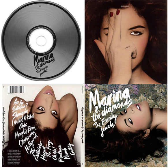
 This digipak is for the solo artist Marina who is indie-pop. Her digipak differs from the two above because it features her on three out of four panels of the artist with the same editing style which is difficult to describe but it reminds me of old Hollywood glam and all the shots of her feature her eyes. The images of her are quite sultry and overly confident and fierce there she dominates the album and that is probably suitable since it her album and none of these shots show her with clothing she is either thrusting her head in some awkward direction that builds a shape and interesting dynamic for the album which I like. The front panel has the her stage name and the name of the album The Family Jewels, in the same typograpghy but in a smaller font. this dominates the the cover against the rich gold, green and purple floral background. The back panel is different background that is a simple white background with her hair flowing down the edge of the panel displaying the tracklist in a downward swipe to the right, which is distinctively different to the basic tracklisting postioned one beneath the other like the coldplay back panel. Also another significant feature of the back panel is the bar code used when purchasing items from a store. Then the cd panel is again is plain and simple with a silver appearance with black circles near the outside of the cd and near the hole in the centre, with the artist and album name displayed in black on top of the cd.
Conclusion:-
I found this research useful and I am already inspired by some of the examples I have analysed for the development for our artist digipak. I learned how it doesn't matter that the artist is evident on the cover of the album and how indie digipak are mostly artistically inspired to be different whether if is the style of photography used in the Marinna and The Diamonds album over, or the incorporation of nature in the Kings of Leon album or physical art piece personalised for the scheme of the coldplay album. I can go in any direction for the indie album from looking at these as a guide. I know that for the digipak we will display a bar code so that it fulfils the convention of a regular digipak in a music store.
Kings of Leon- Only By The Night Album cover
 |
Coldplay Mylo Xyloto Digipak


Brit Rockers ColdPlay new entitled Mylo Xyloto features graffiti pop-up art designed by David A. Carter. On the left is the front cover of the digipak with the album name but without the bands name the typography is like a bubble like font which is only an outline with no filling in the font which allows you to see the rest of the graffiti artwork. The artwork used for the cover is fun and vibrant with the main colours being blue, purple, pink and yellow. Some of the artwork compiles some long text along with images of clouds and other abstract patterns.
 Then below the front panel is the back with the track list for the album in the same style of the typography used for the front cover. Then below the songs are some symbols also in white outlines including a heart, birds and other symbols that may be related to the mood or themes of the album.
The CD panel is the same rainbow colour used for the back panel containing a black swirl which listed the songs of the album above it in white in the interesting pattern around the CD.
This album by coldplay is unique because the artwork was specifically for this album and the same colour scheme and artwork is used through all three panels. This digipak differs from the cover for the Kings of Leon album such as there being no sign of member of the band featured on the digipak, this could that they are internationally recognised that fans know who they are and know what they look like that it would be more interesting to do something creative which both coldplay's and kings if Leon album share.
Marina and The Diamonds Digipak
Conclusion:-
I found this research useful and I am already inspired by some of the examples I have analysed for the development for our artist digipak. I learned how it doesn't matter that the artist is evident on the cover of the album and how indie digipak are mostly artistically inspired to be different whether if is the style of photography used in the Marinna and The Diamonds album over, or the incorporation of nature in the Kings of Leon album or physical art piece personalised for the scheme of the coldplay album. I can go in any direction for the indie album from looking at these as a guide. I know that for the digipak we will display a bar code so that it fulfils the convention of a regular digipak in a music store.
Monday, 20 February 2012
Ideas for the Front Panel of the Digipak
Apart form making the music video the brief also insist we produce other promotional material of our choice. Our group has decided as part of the Ancillary Task to design a magazine advert and the digipak.
Here the briefs says:
1. A promotion package for the release of an album, to include a music promo video, together with two of the following three options:
I decided to design the the single of the music video we are creating 'Nights of Broken Sleep' as a form of design practise prior to the digipak that I design later as part of my ancillary tasks. Below I have produced a variation of one idea and another on influential people that in history never grew tired of the desire for change, this was a long , but enjoyable process producing the several ideas for the digipak.
The production of the digipak is ultimately the job of an graphic designer, but I think I can bring my creative streak into developing some cool and unique design ideas for the potential CD cover. So I had to take into consideration the software's I could to the best of my ability because last year we worked heavily on the promotional material for the artist, I am familiar with the process in which I have to go through to produce Cd cover. For instance the font that use does it fit best with the genre that is your artist, is the artwork original photography or drafted off the Internet? All important areas and more to evaluate when making up ideas for the CD cover.
From designing the single for the video that I am directing was a great form of practise to get out some ideas through developing ideas in connection with the title of the songs that I could do the same with unrest, by choosing images or themes that depict that feeling of Unrest. I would like to develop one of these ideas further for the cover of the digipak. I think with some research of other professional digipak our group can devise a great digipak for our artist Oliver Fox.
Here the briefs says:
1. A promotion package for the release of an album, to include a music promo video, together with two of the following three options:
- a website homepage for the band;
- a cover for its release as part of the digipak (CD/DVD package);
- a magazine advertisement for the digipak (CD/DVD package).
The production of the digipak is ultimately the job of an graphic designer, but I think I can bring my creative streak into developing some cool and unique design ideas for the potential CD cover. So I had to take into consideration the software's I could to the best of my ability because last year we worked heavily on the promotional material for the artist, I am familiar with the process in which I have to go through to produce Cd cover. For instance the font that use does it fit best with the genre that is your artist, is the artwork original photography or drafted off the Internet? All important areas and more to evaluate when making up ideas for the CD cover.
 |
| I was inspired to develop a collage artwork for the cover. Many of the photography was taken by our team member Hannah. While also consisting a section of the actresses face that is obsessed over in the video. |
 |
| This cover is an alternate version of the one above, in reverse order. the colour scheme being limited to just black and white, I think it holds more mystery like the artist in the video. |
 |
| The theme of this cover art is of the most influential people form Winston Churchill to Martin Luther King. I took the idea of Broken sleep is what these individuals went through when fighting for what they believed in. Radika came up with idea and I thought I might experiment with it and select ultimate figures in history. |
 |
| I personally like this cover art, it uses the same images cultivated in the first cover above. Only that it block at most areas featuring only Salvador Dali's painting 'The Rose', sleeping pills, and water balloon. I was inspired by stain glass windows, and this idea that is where the artist in the video may want to seek forgiveness for his actions. |
 |
| I use a unique bubble typography in the first, however, I don't think suits an indie artist. |
 |
| This font is alot less chunky than the first one, I like this one because of the blue glow around it, this reminded me of X-files. A show about investigating alien life. |
 |
| This was the first text I considered for the first cover art, other than liking the small distortion in the text, I didn't think fit well with the image of our artist. the font we chose for the artist make is key because it will become an official representation/reflection of artist brand and logo. |
From designing the single for the video that I am directing was a great form of practise to get out some ideas through developing ideas in connection with the title of the songs that I could do the same with unrest, by choosing images or themes that depict that feeling of Unrest. I would like to develop one of these ideas further for the cover of the digipak. I think with some research of other professional digipak our group can devise a great digipak for our artist Oliver Fox.
Subscribe to:
Posts (Atom)